I recently decided to make prints of some of my photos. I’ve made a few to hang in my house before, but holding an image in your hands is satisfying. I need external motivation, so I decided to participate in the print competitions that my photography club holds. The Photographic Society of Rhode Island (PSRI) holds several open competitions throughout the year, with entries for digital projection, and both color and black-and-white prints. We even have slide competitions. Color print competition is in two classes, Class B and Class A. Newbies like me enter Class B. Black-and-white print competition is only in one class, so newbies and seasoned print-makers compete together.
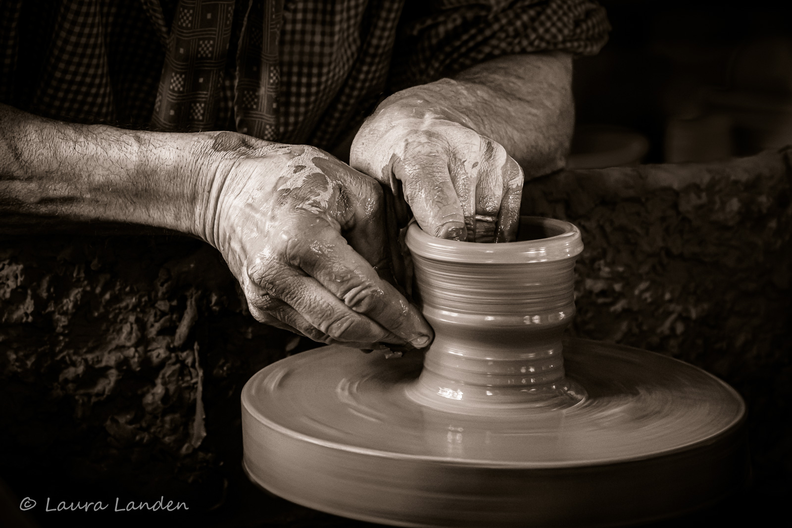
PSRI has four open competitions this year. I missed the first one, so I submitted prints for the second competition as well as make-ups from the first competition. We had the judging last evening, which provided a nice distraction from the election results pouring in. They showed the black-and-white images first, so I watched as the scores were announced for my two make-ups and one of my regular submissions. Where was the other one? Honorable Mention? No. Third Place? No. Second Place? Again, no. I could hardly believe it. I got first place in the first competition I entered for prints. I worked hard on the image, trying to get just the right balance between light and dark, and the most appropriate shading, which was a new challenge for me. Let me show you a comparison of the original image and the final product of my labor. Just slide the line back and forth over the image.


I did several things when editing the image, but the first step was to convert it to black-and-white. I tried a method new to me that I learned from my friend, Cemal Ekin. Cemal recently posted on his blog about using the linear gradient mask in Lightroom Classic to perform the conversion. I like this method, as it leaves you with full control of color variations as well as toning the final edit. I used several other techniques to emphasize the light on the pot and the hands of the potter. Here is the final image itself.
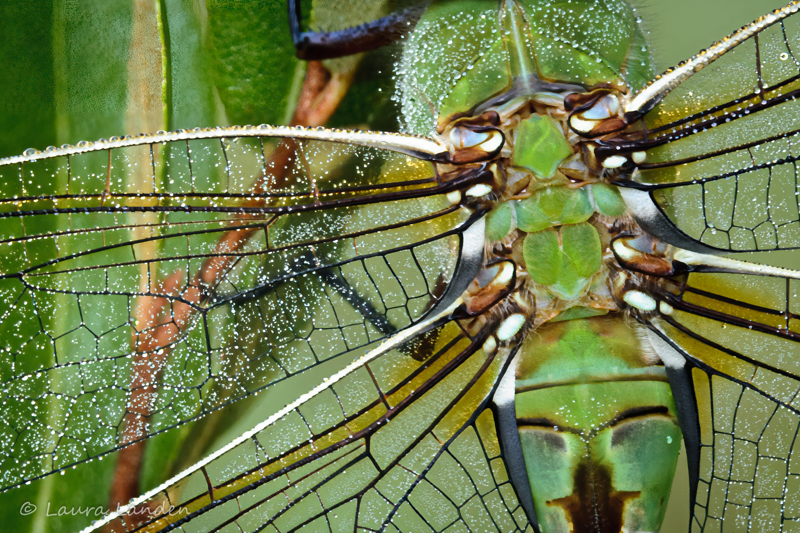
Then came the Class B color images. Again, I watched as my make-ups and one of my submissions were posted with their scores. Where was the other one? Not HM, or Third, or even Second. Really? I won first place in color prints, too? This image is familiar to anyone who has been to my house and used the bathroom or been the recipient of my business card. You, as a visitor to my website, see it on the opening page. It’s probably my favorite image, Green Darner #40. I made this image during a photography workshop in the upper peninsula of Michigan several years ago. The copy in my house is printed on metal, so I printed the competition image on metallic paper. Here it is.
I want to be clear about something. That I won two first-place awards with my first competition entries is not the point, however affirming that may be. I am not printing to win prizes, but simply because I like it as a final step in realizing an image. I am also assembling a portfolio of prints in a smaller size. I’ve included the ones I enter in competition as well as others I like and want to share in that way.
Wonderful, Laura. The cropping on the darner allows even greater apprecation for the abstraction, and the potter’s hands, the spinning creativity, are appropriately lit in the ambient background. Thanks.
Congratulations on embarking on printing and monochrome conversions, Laura. Oh, nice to get first place in the competition too!!
Cemal